
|
Manifest Technology Making Sense of Digital Media Technology By Douglas Dixon |
|
|
Articles: | PC Video | Web Media | DVD & CD | Portable Media | Digital Imaging | Wireless Media | Home Media | Tech & Society | Portable Media: | Portable Media Articles | Portable Media Player Gallery | Much Ado: The BlackBerry Storm
|
Recent Smartphone articles:
See my Mobile Communications Gallery for more on smartphones |
The BlackBerry Storm (www.blackberry.com/blackberrystorm), released in November by Verizon Wireless (www.verizonwireless.com/storm), extends the BlackBerry platform for multimedia with an interesting new touch-screen display.
With a variety of recent new models, BlackBerry has been moving beyond its image as the tool of madly thumb-typing communications-obsessed executives, to broaden its support as a general-purpose PDA and multimedia device.
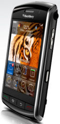
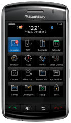 Storm, Home screen and applications menu
But the Storm goes significantly further by abandoning the keyboard altogether in order to provide a large 3 1/4 inch display that covers the front surface of the device, and therefore uses a virtual touch-screen keyboard interface like the Apple iPhone.
The display also uses an interesting new "clickable" design for the touch-screen -- you actually feel the screen depressing and releasing like a keyboard, with a subtle "click" sound.
If you read the reviews however, the Verizon Wireless / BlackBerry Storm has kicked up a real tempest, as the Storm seemingly has fallen far short of its hype. In particular, David Pogue was very clear about his opinion of the product in his New York Times review, and in his follow-up post with reader responses: He calls the Storm "... by far the worst product Research in Motion has ever produced. I had problems with its concept, problems with its clicky touch screen, problems with its speed, and above all, problems with bugs."
www.nytimes.com/2008/11/27/technology/personaltech/27pogue.html
http://pogue.blogs.nytimes.com/2008/12/04/readers-react-to-david-pogues-review-of-the-blackberry-storm
The real issue is that the Storm is an interesting but flawed version 1 product, suitable for early adopters and technology enthusiasts, and should not have been hyped for the mass market.
Compare Pogue's response to the original Apple iPhone -- "As it turns out, much of the hype and some of the criticisms are justified. The iPhone is revolutionary; it's flawed. It's substance; it's style. It does things no phone has ever done before; it lacks features found even on the most basic phones."
But even after discussing significant issues and flaws with the iPhone, Pogue concludes, "But even in version 1.0, the iPhone is still the most sophisticated, outlook-changing piece of electronics to come along in years. It does so many things so well, and so pleasurably, that you tend to forgive its foibles."
http://www.nytimes.com/2007/06/27/technology/circuits/27pogue.html
In comparison, while the Storm is an interesting attempt to marry the BlackBerry platform to a new touch-screen display, it's not a revolutionary breakthrough that could mitigate first-release flaws.
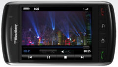 Storm in landscape view as a multimedia video player
The fundamental design decision that has caused the most anguish with the Storm is the removal of a physical keyboard -- which is, after all, the defining element of the traditional "crackberry" use of a BlackBerry. No on-screen keyboard can compare to the efficiency of banging away on physical keys, so maybe this product should not have been called a BlackBerry at all.
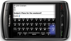
So how does the on-screen keyboard work? In portrait mode, you can choose between two different keyboards: the Multi-tap phone keyboard, with numbers and multiple letters per key (press the keys multiple times to select a letter), and the Blackberry SureType keyboard with two letters per key, with software assist to suggest words. Then in landscape mode the Storm displays a full QWERTY keyboard, with separate pages for numbers and symbols. But there's no iPhone-like intelligence to guess words and correct typing mistakes.
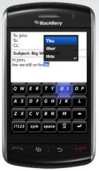
SureType keyboard with two letters
per key -- with software word assist
Email with
full keyboard in landscape mode -- with glow highlight on selected key
The idea behind the new "clickable" touch-screen, then, is that it provides a more natural experience for typing and clicking virtual keys and controls. The interface can react to gentle touches and movements (for zooming and panning), but selecting options and typing on the keys requires a firm press to click the display (the entire screen actually depresses and returns). The click interface is an interesting idea that may grow on you with extensive use, but in my limited experience it's a distraction to have to think about how hard to press, and wearying to have to be focusing on holding the device tighter and pressing firmly.
The click interface really does not seem to help with trying to type fast on the virtual keyboard. As you move your fat fingers over the tiny keys, the Storm does display a blue glow around the currently-selected key, so you can see the glow even though the key is obscured by your fingertip. Then you must press firmly on the key, trying to avoid having your finger slide or roll even a little to accidentally press the adjacent key. I did get better with practice, and trying to use only a corner of my fingertip, but typing on the Storm still required careful attention to watching each key press and checking for errors.
It's interesting to see how device designers respond to the user interface challenge of the small screen, especially how to show big views, like web pages, on a limited screen. The Storm and similar devices make this even harder, since the screen can be oriented in portrait or landscape mode, and may or may not have a keyboard covering a portion of the bottom of the screen.
As a result, even menus and dialogs in the Storm are scrollable, which can be disconcerting when you don't initially see the option that you want to be visible on the display (there's a subtle icon to show you need to scroll for more).
The Storm interface also eliminates explicit OK and Cancel buttons for on-screen dialogs in many instances -- instead you need to move your finger off the dialog and use the Enter key on the keyboard to confirm, or move down further and use the physical Escape (Back) key to cancel.
|
|
The Storm's Home screen
Selected applications at the bottom of the display, with the row of dedicated physical keys below: - Send key - Make a phone call (Phone app) |
Menus and dialogs often further save screen real estate by omitting identifying titles, which can cause you to lose the context in which you are working. For example, the Storm does include extensive built-in Help (including short videos), but the topics are listed as lines of small plain text on a plain white background, with no context of how you have descended into nested topics, and no apparent way to move step by step through related topics. (And there's no search, so, for example, I never did find the explanation of Cursor Mode in the Browser.)
The Storm clearly is a version 1 product that needs further development. The physical design feels solid and looks good in smoked black, but on my evaluation unit the bottom of the display screen is pulling away from the frame to expose the tops of the keys below and open a view into the interior of the unit. And the row of four physical keys were inconsistent in responding to key presses -- some requiring heavier presses than others.
The software also responded sluggishly. Turning between portrait and landscape orientation sometimes took multiple seconds to respond, although this seemed to improve somewhat with the upgrade from version 4.7.0.65 to 75. On the other hand, the orientation switch also was twitchy -- sometimes switching when the screen was tilted only at a small angle, for example when reaching around to the volume controls or showing the screen to another person. This was particularly disconcerting in applications like V CAST Music, which blanked the screen for multiple seconds before redrawing in the new orientation.
(The upgrade from version 4.7.0.65 to 75 actually ran just fine over the wireless connection, although I had to find out about it by reading news online. It's located under Options > Adv Options > Wireless Upgrade. The 14 MB download completed in around 7 minutes, and the upgrade process then took about half an hour.)
As shown in Verizon's TV ads, the BlackBerry Storm can be a fun device for technology enthusiasts who want a BlackBerry that does multimedia. It's an interesting effort to move the BlackBerry interface to a touch-screen device. While the Storm is not the answer for the rabid "crackberry" communicator, it does allow other functions like Web browsing and certainly media playback to run better on the larger screen. As on the iPhone, touch-typing on the small virtual keyboard can be difficult, and we'll have to see how users respond to the new "clickable" display over time.
BlackBerry - Storm
www.blackberry.com/blackberrystorm
Verizon Wireless - Storm
www.verizonwireless.com/storm
Verizon Wireless Estore - Storm
estore.vzwshop.com/storm
Verizon - BlackBerry Storm Tutorial
93 slides - https://webinar.verizonwireless.com/p10586928/
Verizon - BlackBerry Storm Interface Demo
http://cache.vzw.com/multimedia/mim/bb_storm/
Verizon Wireless - Storm Software Upgrade Instructions (PDF)
http://learning.verizonwireless.com/learning/Storm_Software_Upgrade_QRG.pdf
![]() Find the Verizon
/ BlackBerry Storm on Amazon.com
Find the Verizon
/ BlackBerry Storm on Amazon.com
|